
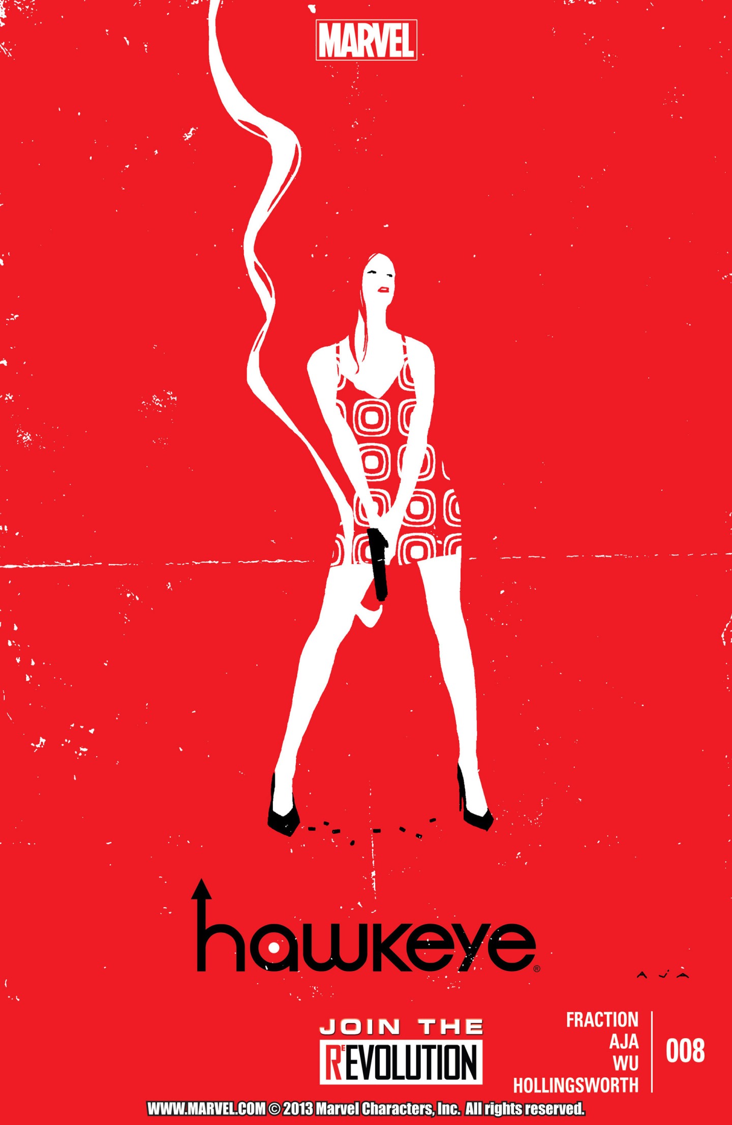
 David Aja has produced incredibly stylish covers for all the Hawkeye comics and this one is an exceptional one. He combines his art with a focus upon imagery and composition. There is a lady holding a recently fired gun in a sexy and alluring stance. She is wearing high heel, a short skirt dress, and has bright red lipstick. There are no signs of fear or anxiety and she appears quite comfortable with multiple bullet casings by her feet. The sexual connotations to her image together with the act of gunplay, lead us to the femme fatale persona. The composition of the page is remarkable as she is quite small in the middle of the page and the smoke lingers well above her. Part of this is to highlight her, the effect of the gun, and the colouring composition of the page. The stylish design of her dress and her red hair merge into the background leading to a wonderful effect. Red has multiple connotations as a colour and in this case it screams sex and violence. I also admire the use of only three colours as the character matches the lettering at the bottom of the page. A final subtlety is the faded white line in the middle of the page and the specs throughout. It is almost as if the whole cover is a glamour shot and the image is folded together. It brings up the image of a man having a picture in his wallet, that is pulled out repeatedly leaving the fold marks in the middle of the picture and the white specs of age. It is an iconic centrefold image, representing the incredible work David Aja has been doing on Hawkeye. He has taken his art to a stylised pop culture direction and I just want to blow up all of his covers and put them on my walls.
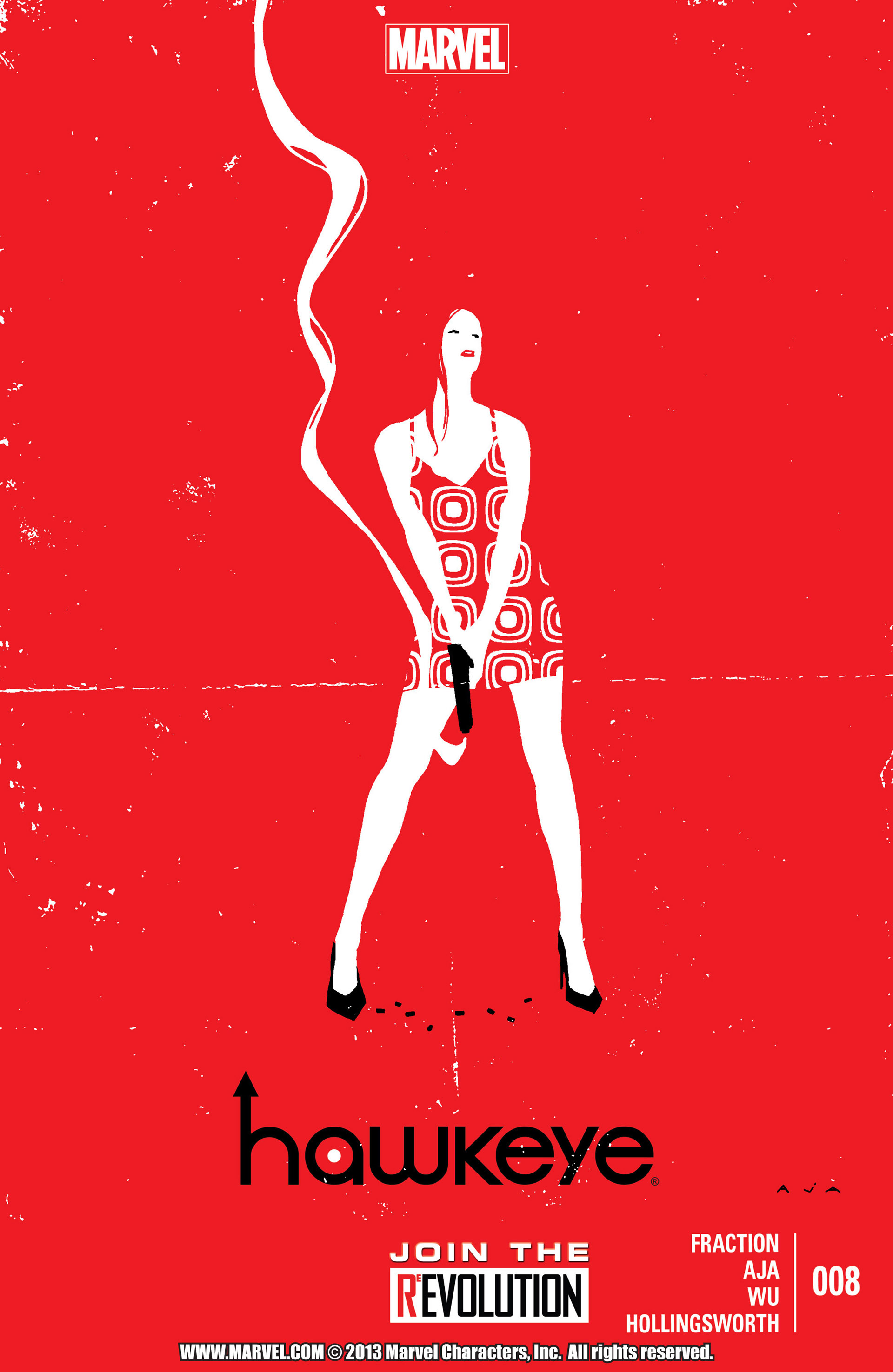

“A final subtlety is the faded white line in the middle of the page and the specs throughout. It is almost as if the whole cover is a glamour shot and the image is folded together. It brings up the image of a man having a picture in his wallet, that is pulled out repeatedly leaving the fold marks in the middle of the picture and the white specs of age.”
Wow! That’s a great catch. I didn’t think of that when I was writing mine. Nice analysis!
I concur with thegothamrogue here! great catch on the fold lines! went right by me! I tend to check your cover analysis week to week for that very reason! I get much too anxious to get to the story inside and oftentimes I miss a good deal of storytelling right on the front! Once again superb analysis!
Thanks dude! Its an incredibly subtle and amazing detail