
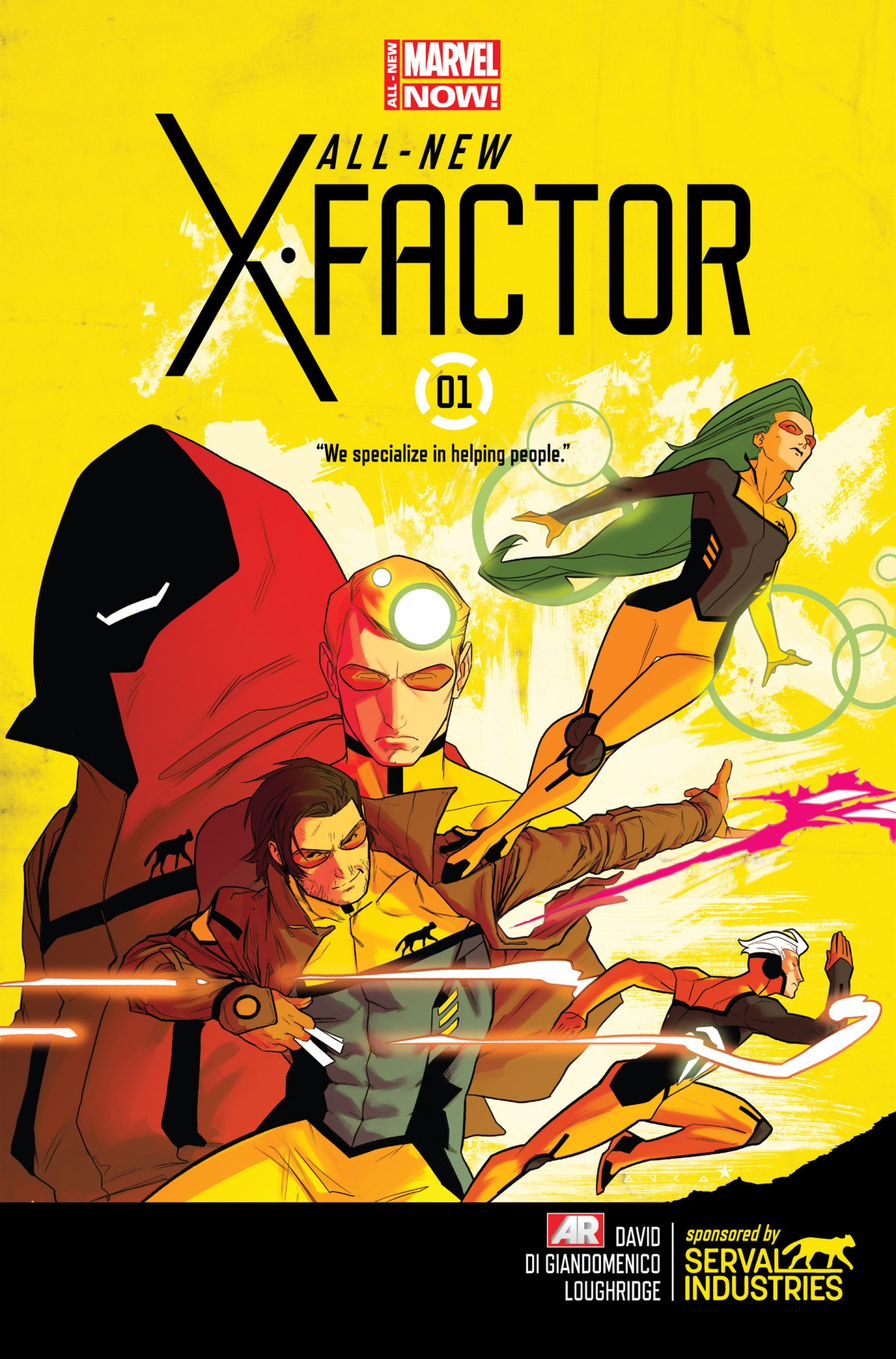
 There were once again a few decent covers this week, but this book had such style and…..pzazz! It is energetic, vibrant and dashing. There are a number of reasons as almost every aspect builds into this dynamic image. The cover feels like it is moving, this is not only just because Quicksilver is in mid sprint. The positions of his hands and the glowing lights sparking from them give the feeling he is running at full speed. The penciling is thin and streamlined with cutting edges. Gambit is in full extension and driving his kinetic energy filled playing cards across the page. The purple intensity is itching to hit it’s target. His head tilts and his gaze it towards us as he arrogantly throws his projectiles without even looking. Polaris is similar but brings circular bulges of magnetic energy that elevate her into the air. She is also in a sleek and elegant pose, ready for action. Note her perfectly controlled slickly flowing lime green hair. The other two characters are more mysterious but are also modelling sly charismatic grins and more eyewear. There is certainly a uniform for this new X-Factor group and the yellow and green colours are worn well. It is stylistic outfit with figure hugging designs that highlight physical attributes but also slick black definition lines. The colouring is so aesthetically pleasing as they fit so well together and the blending of yellow and white in the background is delicately balanced to allow emphasis when needed. The energy emanates off the page as it sparks from it’s owners hands. The Serval Industries logo is scattered across all the characters and there is clearly an underlying mystery at hand. It is hard to imagine why Gambit and Quicksilver would follow a commercial company, given their reputation for rebellion. This is reinforced by the hooded character with no visible face and a mischievous grin. The new X-Factor title has also been branded to a simplistic and stylish font. The film noir X-Factor book went a long time ago, but this page has certainly brought about a completely contrasting frenetic vibe. It begs questions of the nature of this team and also its members but the tagline below the title implies a positive vibe. This cover brings optimism for a book with an exciting team members, full of style and energy with confidence to match. Let us see how much helping they actually do.
