
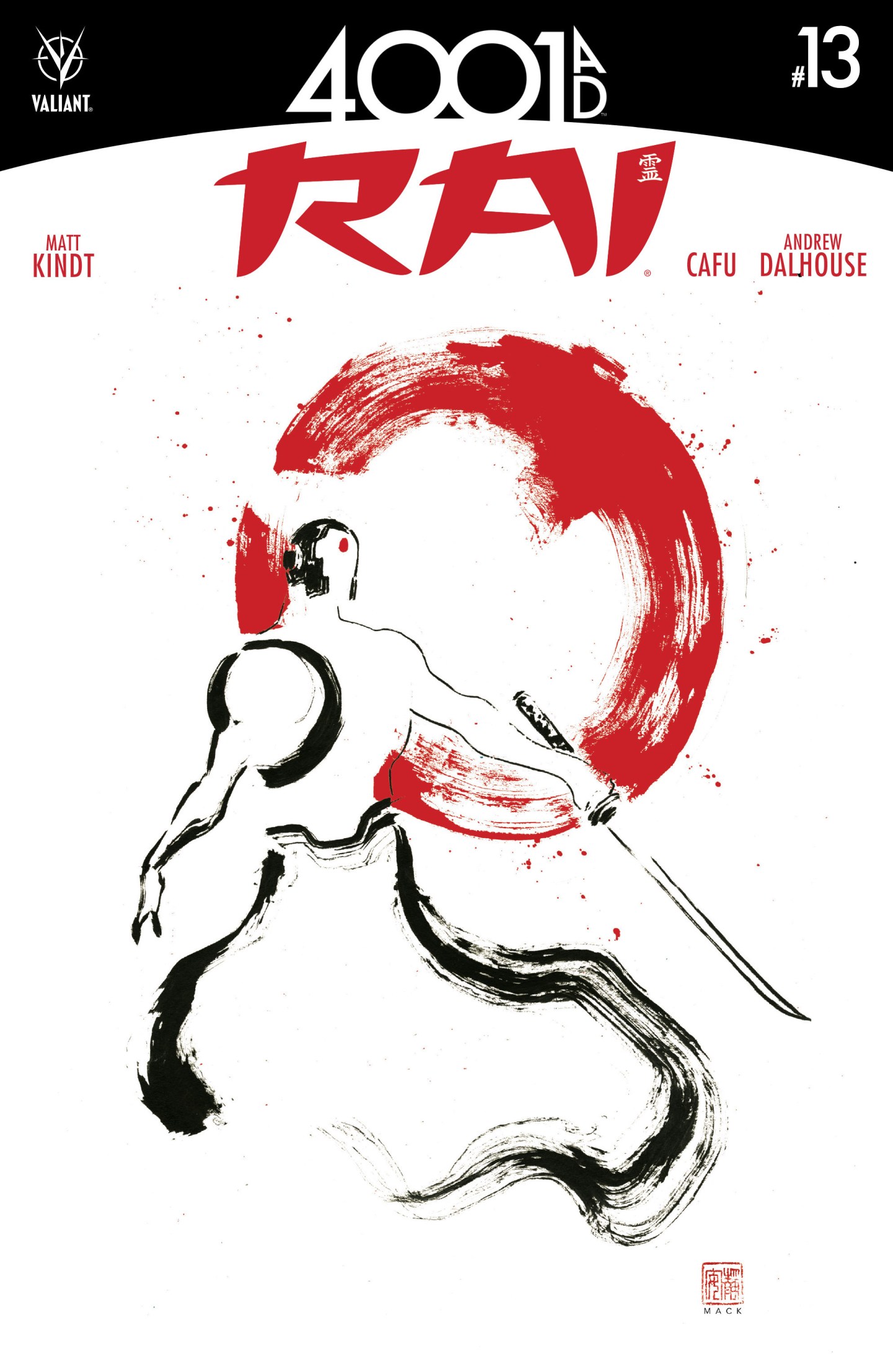

David Mack features often in my writing because there is an endless amount to say about his work. His imagination and diverse skill set brings so many different artistic facets to the table. I collected all of his covers for Fight Club 2 just to see what he would do and how he would do it. Now as he produced the covers to Rai, we see another element of his skill. The deconstruction of this storyline and character to two colours and designs is testament to his understanding of the book. The samurai figure is quite pertinent, not just because of his shape but the red dot symbolism of Japan in the background and on Rai’s forehead. It is the delicately painted sword with definition left to the imagination as well as the eye. The hakama is painted in almost a single stroke with a wider paintbrush, giving the impression of heft and movement. The finer strokes provide details on Rai’s torso and headwear giving a futuristic impression. The large setting sun in the background is almost withered between the bristles of a large paintbrush and sliced in two from the sword. It is enigmatic and may present the destruction of old Japan, with Rai heralding the new lands as he does in the comic. It is interesting how much insight can be provided from a seemingly simplistic cover, but one that fully understands the fundaments of the comic it is promoting. And that is why David Mack is such a wonderful artist and why there will be endless amounts of discussion on his work.
