
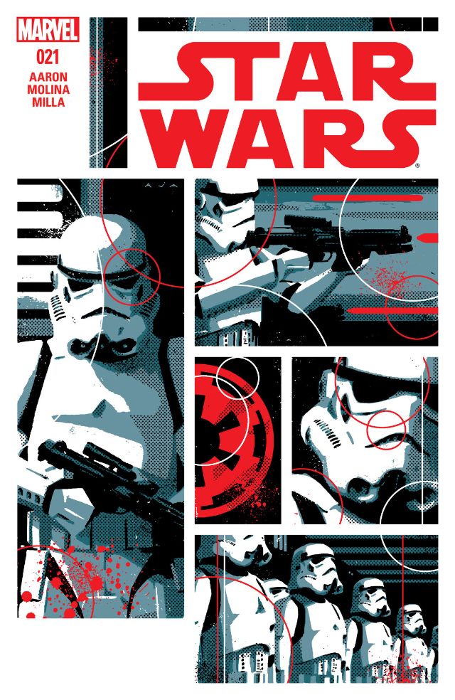

It makes you wonder how David Aja hasn’t ventured into advertising or commercial graphic design with the incredible amount of style he presents to the comic industry. We saw glimpses of it with the covers of Hawkeye which all had distinct themes and effects. This is another example of that skill, currently employed by Star Wars and more specifically the Empire. There are only a few pertinent images to this page that are utilised in so many ways; the circular shape of the Imperial crest, the Stormtrooper armour and the colours red and black. The grayscale feature allows Aja great scope to draw and colour stormtroopers in dramatic action or poses, using interesting lighting effects. It is viewed almost as a promotional poster as you seen a straight forward looking gun toting figure followed by another pulling the trigger, and then a head tilt close up before they fall into line. The Imperial crest is central to the image and places authority to the page, but it is by no means overwhelming. It’s circular shape is repeated and overlapping the well structure panels, and is coloured white and red. The red comes into play with splatters of blood intimating violence, and with the crest also being red, it becomes a symbol of authority. These are the stormtroopers of the Empire, they are tough and they are dangerous. With an overwhelming amount of poise and purpose in this composition and David Aja entices us once more with a cover of sheer villainous glory.
