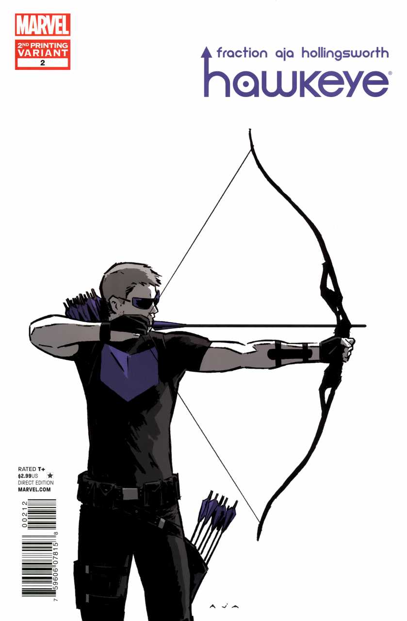
 Matt Fraction has a reputation built on his work on Immortal Iron Fist which was also drawn by David Aja. I’ve liked some of his work but was put off with the X-Men run but David Aja I know well. His work on Daredevil was dark and depressing which was absolutely needed for the misery of Matt Murdock. They return here with the solo Hawkeye book which begs one question: Given Hawkeye is a normal man with exceptional accuracy, and now the Avengers tag and powerful support cast have been removed, who is Clint Barton? The first issue set him up to be a fallible hero who actually spent time tending to his injuries in a hospital! Whilst not being called for world emergencies he appears to be a vigilante and champion of the people, well in his block of flats at least. It is an interesting concept but it does mean that Hawkeye will be involved in lower key adventures, which has great potential for a personalised story.
This is stand-alone issue is based around Clint Barton visiting a magic show run by thieves with a female counterpart; the former Lady Hawkeye Kate Bishop. It is a reconnaissance mission that turns into a robbery foil. The story is average as there are no real interesting or original facets to the plot. There are a couple of interesting bits of writing and ideas such as the origin of the Vagabond code and the phone call at the end but Hawkeye the man? Well there does not appear to be too much outside of him being a “good” guy and developing feelings for his special lady friend. There are no feelings shown for him being an Avenger or being a powerless human. I hope we develop on this as it has depth. On the whole Fraction writes reasonably but allows Aja to make this book look gorgeous, which is why I like it.
David Aja has done an incredible job and has unique panelling giving his action scenes a beautiful flow. Examples of this include the firing of three simultaneous arrows, the main fight with Kate running and firing arrows whilst Clint catches her and the final phone call scene. He has a thick rough pencilling technique that correlates with the intense action but also seems to work in proving visuals to regular conversations. Matt Hollingsworth is the colourist and is as important as the artist because the colour palette is so good especially as it is of a few colours and shades. It holds the atmosphere brilliantly and makes it a very stylish comic. The artwork and colouring alone stop you from needing to read the writing. I remain unconvinced that Clint Barton has a unique story to tell but it is only issue two.
Beautiful to look at 8.5\10

