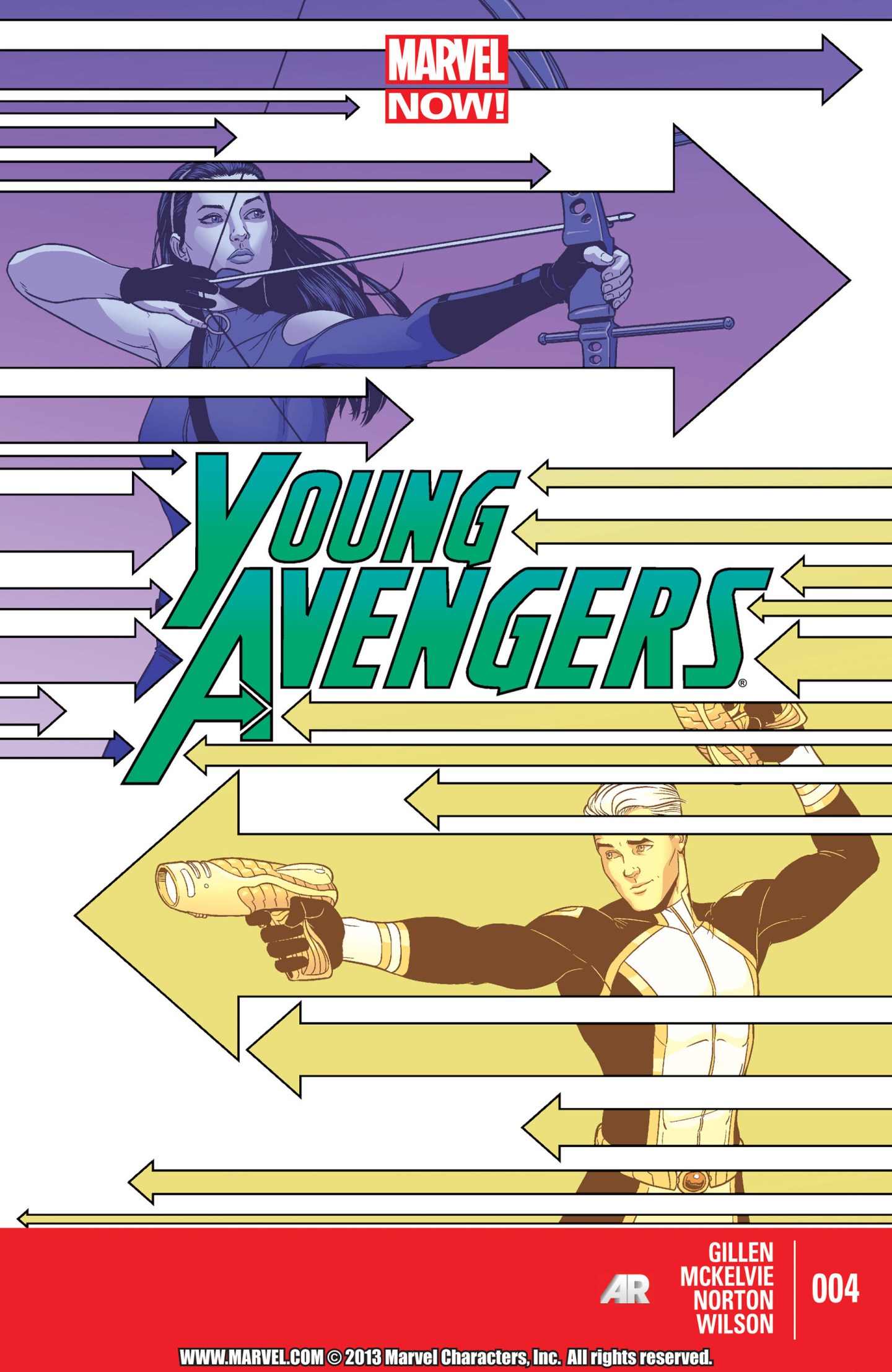
I have been itching to discuss Jamie McKelvie’s art since the release of the first issue, and I was delighted to see this cover on the shelves. It takes inspiration from pop art to produce an advertisement like facade to the comic. In this case we have lovely symmetrical images of Kate and Noh-Varr in sleek poses, weapons in hand. It is a nice touch to have Hawkeye poised to fire an arrow and Marvel Boy steadying aim with his gun, with a flourishing left hand in the air to emulate Kate’s position. The ornamental left hand is in keeping with the youthful exuberance and arrogance of Noh, further demonstrated by his curving eyebrows. McKelvie has a lovely succinct style to his pencilling where it is not overtly detailed but incredibly expressive. The facial detailing is stripped to a simple visualisation of emotion and adds to the stylish nature of the book and characters. The panels are arrow shapes and our heroes are revealed in their shapes, towards the direction they fire in. The colours yellow and purple (certainly a Hawkeye colour) are a lovely blend around a central green title header, kudos to Matthew Wilson. The symmetry is the greatest quality of the cover and may symbolise the closeness of Kate and Noh, they are fighting for each other and mirroring one another. It is not a far push to think they are standing back to back, attacking oncoming enemies together. The team are coming together and this is a wonderful promotion to a comic that is asking you to come with it if you want to be awesome.