

You may have read about my opinion on Noah Dorsey’s writing in the review of the first issue of Saint’s Chaos, but I would like to take the time to focus on the art and environment of the book. Noah has built a terribly grim part of town to stage his story, and the fear and violence emanates from it. The underlying premise of the book is exquisitely unique and we have an antagonist who equally as disturbed. The writing remains excellent and the plot is making steady pace without washing over themes and essential story points. However the pencilling and colouring by Zsombor make it a harrowing book to read.

The whole of the book is engulfed in shade and minimalist colouring. There are beautiful effects depending on whether or not there is daylight. It is a veritable accomplishment to produce such depth and emotion with shading effects. The panel below is a great demonstration of how to use focused light on a scene to depict violence and intimidation. The guy with his head in a wall and Saint Chaos beckoning to another gentlemen is enough to make you run as fast as you can. The subtle shading of his eyes from his orbital ridges and his neck from his extended collar, together with the shadow cast on the beaten man, achieve the desired effect.

This scene is almost an extension of the above where Chaos threatens Honeycomb, and this side profile shot is fantastic. The lighting appears to be from a dim street lamp shining from our protagonist out to villain. Saint’s freshly sutured scalp lacerations are horribly detailed but his crows feet, gritted teeth and hand scars portray the anger of a bitter man. It juxtaposes to the freshly preened extravagant looking, hat and scarf-wearing villain. The shot provides such contrast to the underlying relationship to the two characters, one the serial murderer who has given the other a couple of days to live. This panel makes it difficult to establish which character is which. The exuberance of our antagonist is also well depicted in the next panel, which adds subtle elegance to the very expressive and congenial visage of Honeycomb. He is suitably disturbing, even without reading the speech bubbles, as his charismatic eyes and excited smile brings out the joy he is feeling, whilst holding an enlarged torture corkscrew. The delicate colouring to his eyes and lips, with a lovely green glow to his irises brings out aesthetic beauty to his ignominy.

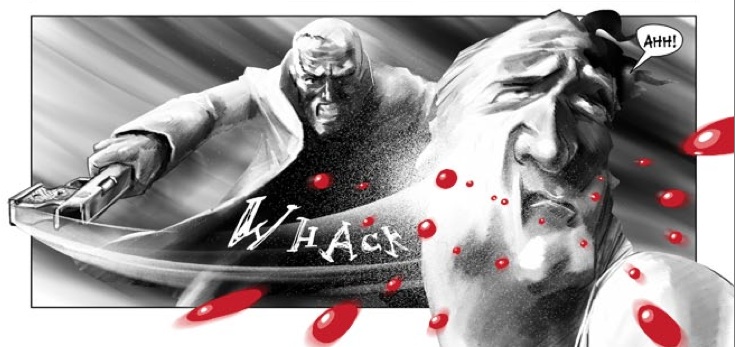
Once again to demonstrate the importance of the colouring, the panel below shows its use to emphasise the violence and viciousness of Chaos. The sound effects and swipe lines bring out the extent of the strike but the blood makes it appear as if the splatter is coming from out of the page. This effect is continued with the characters defying the borders of the panel, and the pistol whip breaking the contours of the book with such ferocity. Saint Chaos is a fierce man and Zsombor brings this out wonderfully with shading and colour, with an air of hopelessness and desperation. The art is incredibly engaging and emotionally upsetting, which is reason alone to buy this book.
For further information and for sales of this incredible comic, please check http://www.er-studios.com!!!
