
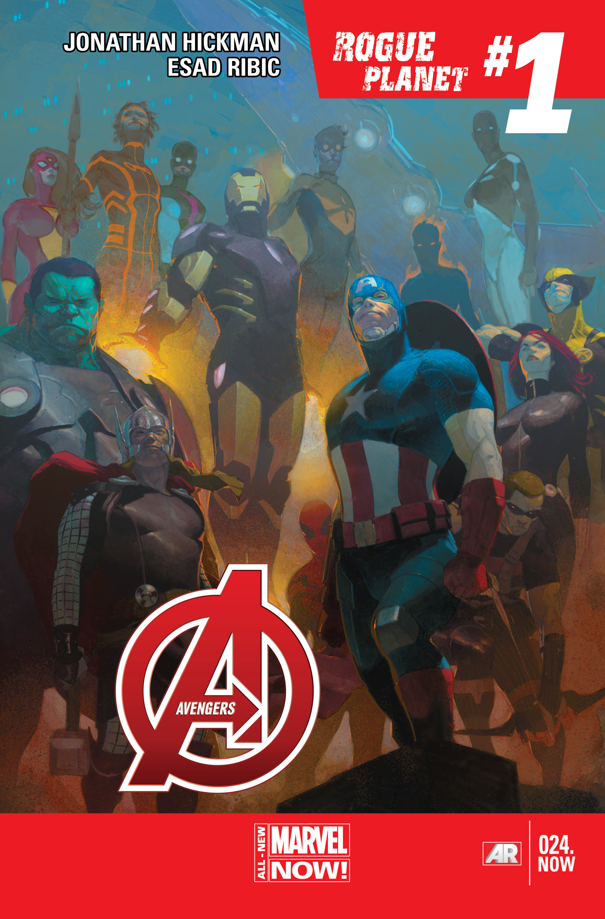
 There were very few covers to choose from this week and Esad Ribic would always feature high on any list. I am unsure of the colourist on this piece but it is a strange cover tonally. There is a classical feel to the book, almost a faded image as the depth of the cast is portrayed through the colouring. There is very little inking and the shade deepens to create perspective but it serves to darken the image. Esad’s work is always impressive and this crew picture is superb, especially the way it is laid out. The big guys habit the foreground of the shot and the smaller characters in the back. It is successful in distinguishing the heroes, and not just because the costumes are ready identifiers. The postures are epic, in that chests are held high and heads aloft with eyes gazing downwards. Arrogance is in the air and this team is full of confidence after the events of Infinity. It is a quality that Ribic established with Thor ever so successfully, and I look forward to seeing how he employs that with the Avengers. Aside from the murkiness of the colouring, another complaint I have is that the title and Marvel Now banner take up too much space, and the upper left title is far to imposing on the picture. This has been a continual problem with Marvel now books but with the colouring issues impinging on the grandiosity of the picture, it poses a bigger problem. Either way Ribic is incredible and this is a solid cover, and I cannot wait to see how he complements Hickman.

