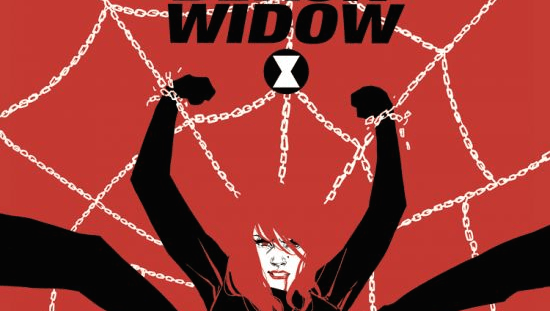
Phil Noto’s art is exceptional to say the least, because he is the master at leaving things unsaid. He colours his own work and has complete ownership of the expression and how it is portrayed. Often he will ink work with fine lines to provide dramatic emphasis or he will leave the inking altogether to allow the colours to provide the movement and direction. This cover is another example of that because the only definite lines exist to show Widow’s tortured expression and the strain of her constraint. The whole cover is red including the background which merges into her hair without break or definition. The fine lines to delineate and shape her figure are red which is more a schematic representation than a realistic one. Obviously the Widow insignia is there to mark out the book and her as the central character. The black colouring is used to highlight her body and the assaulting limbs. Fist fly in and she wriggles and manoeuvres to avoid them which is also down to the effect of the red lines. The white is purposely used to create a the chains of incarceration which hold her tight, especially around her wrists as she attempts to wrestle free. The chains are organised purposely in a web to provide the message that Widow is caught in a trap and is unable to escape. The blood dripping from her lip and the determination of her eyes provide testament to that. Her face is the only feature of the page that has a high level of detail because it is the most important. Natasha is caught in a web of her own design and she is desperate to escape. That is the themes of the cover and that is what comes across so vividly and simplistically by the wonderful Phil Noto.