
The question really is how much is Warren and how much is Declan? When it comes to writing comics there has been many a varied relationship between writer and artist over the years. Whether there is a solo creator taking plaudits for everything or the artist producing the story for the writer to fill in the blanks, e.g. Ditko and Kirby. The Moon Knight book has certainly allowed the freedom for Declan Shalvey to expound his ideas and inventiveness. The plot to this comic is often simple and involves a solitary journey to rescue an innocent, with the weird and wonderful often finding themselves wondering onto the page. However issue five is a little different because it provides an exceptional example of how to portray a raid and the flow required for it to be done successfully. It is an audacious and ambitious feat, which is performed with excellence and swagger and one worth analysing. The scene is set for Marc Spector to enter a derelict building to rescue a kidnapped child. It begins with an intro section of letterbox panelling combined with a wide shot, to introduce the scenario and hint at the oncoming violence. There is a high level of consistency throughout the comic, where Shalvey uses similar pattern of panel boxes. A large square setup shot is often followed or preceded by multiple square or letterboxes, which depict the action sequences. The violence is well portrayed in a sequential and well flowing manner that is easy to follow. Whilst the movements are shown from afar, the impact of the strikes are often brought into focus. It is a lovely effect and one worth repeated viewing, which I shall focus on a little later. We begin with this wondrous splash page, which not only serves as the introduction to the building, but the throwing down of the gauntlet and the acceptance of the challenge. 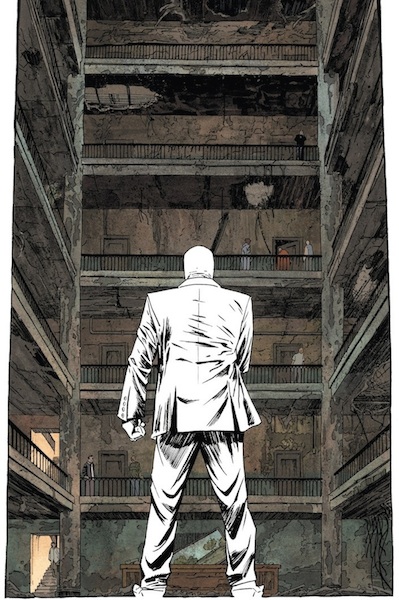 The child is on the sixth floor and there are approximately a dozen guards. We stand level with Moon Knight with a perspective looking up at the sizeable task ahead. It is a lovely effect and the perspective of the floors impress the height needed to ascend. Bellaire’s Spector colouring is a standout feature of the book because not only does it provide stark contrast to almost every other element of the book, but also it reflects his personality. The lack of colour represents his mission that belongs solely to him, and he wears that on his person at all times. The quest for redemption led him to insanity, though we are unclear in what manner that manifested. What we are left with is a determined character ready to make criminals pay, and is far from afraid to enter the front door. This image depicts that as he stands, fist clenched, baton waiting to be wielded. Declan Shalvey is an artist of detail, and the inking of Moon Knight throughout is immensely thorough. This is very clear to see, especially because his clothes are white, and highlight every stroke of the pencil. This places emphasis lines on his suit, which aid us in understanding what movements he is making, and is going to make. When we review the fighting panels below, this becomes more pertinent. Consider that this single issue has very minimal dialogue and is a whole comic dedicated to a one mad raid. It is reminiscent of the actual movie The Raid, which saw policeman enter a villain hideout and work up, floor by floor, to attack bad guy after bad guy. There is also a scene in the South Korean movie Old Boy, where the central character moves along a corridor attacking a huge number of enemies with a hammer. The scene is shot from a wide view and does not waver, producing a stunning continuous fight scene. It is a scene almost paid homage by the cover of this comic. In any case the depiction of repeated brutality is one that can easily delve into gratuitousness, after all there are only so many times one can watch a man being beaten by a stick. This is where Declan devotes time to the craft of violence and brings the motion of the comic into the forefront of the title.
  The basic movement of flow is horizontal and left to right across the floors. The set of panels above show the confrontation set up with a picture of them running towards one another, followed by a zoomed in shot of a kick to the shin. Your eye line moves sequentially from far to closer in, with an appreciation for Knight’s slide to the ground, which then catches the antagonists knee. The scene slowly moves closer and closer to the oncoming kick, where we detach from the rest of the environment, so we are only viewing the strike and its target. This increases the impact and intensity of the action depicted. There is an element of real time and space to the dynamic. This is also demonstrated below with Moon Knight walking to his opponent and striking first. The motif of this page is not the single blow as above, so there is no close up shot, but the fluidity of movements of the fight. The backgrounds once again disappear so we can concentrate on the motions at hand.
  These movements can also be applied to the vertical positions. We can see Moon Knight walk up the stairs and nonchalantly flick a ninja moon weapon upwards. It is not until the viewpoint change where we are above Knight and can only see his head, that we realise the intended target is above him. It plays the subtle close up shot but this time, moving vertically. This scene continues to move in the upward direction as he attacks the man and the panels begin below him but end above him. The fluidity is impressive and easy to follow, but more importantly the stages of the attacks are clearly following a pattern an order.
 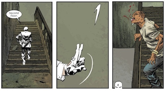 This panel is one of my favourites, mainly because this adversary is well dressed and groomed compared to the others. Jordie allows the colours really shine as the antagonist impresses upon the reader as much as the white of Moon Knight. This is more a to-and-fro attack as the smaller square boxes allow more movements to be shown. It also features facial close ups to allow some intensity to develop as Knight does appear to have met a worthy foe. This is shown by the close up strikes to his tie and a facial expression of impressiveness. The boxes flow easily and depict the successful strikes and outcome.
  The final panels that impressed were the letterboxes alluded to above. The above scene is not overtly action based but does show some dialogue leading to the surrender of the weapon. The wide angle show makes it obvious that Spector is concealing a bloodied bat that his enemy is unaware of. Then the zoomed in box is easily transitioned to, because their hands are almost identical in position to the box above. We then move away to see the inevitable outcome of the bat being put into good use. The use of perspective in this case relays the impact of the force, as the victim is flung across the page with blood splattering. You will notice again the disappearance of background, which occurs throughout the comic. The whole issue is focused upon action and movement, and Shalvey adapts the size of boxes to the type of fight and the impact of the blows. Whether it comes across the page or up a flight of stairs. These are only a few of the pages from the comic but the whole issue it littered with gloriously done dynamic scenes, uses the tools described above. Inspiration must have been taken from cinematography as the book reads as a storyboard, and could easily be transferred to film. Even the title page is similar to the opening credits of a cinematic movie as we see the gradual introduction of the title shot and plot at hand.
 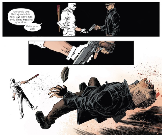 Coming back to the direction of the comic, there would have been an in depth discussion about how the book would flow and the themes it is trying to display. Clearly multiple fight scenes only really bring out the toughness and stamina of a character, but Shalvey prevents boredom seeping in by the sheer variety of angles, assailant and weapons utilised. The themes of fearlessness and courage permeate through the book but develop into confidence and the infliction of fear from our central figure. I expect Declan had free reign to choreograph his action sequences but Ellis must’ve guided the book from its beginning to a natural conclusion. It would be very interesting to know how it was assembled, and I can assure if I see Ellis or Shalvey at a convention I will be sure to ask. This is a wonderful comic showing how fighting can be conveyed with ingenuity and fluidity and I urge you to read it, again and again.

Such an awesome artist who first came to my attention with his work on Venom. I can’t wait to see what he tackles next since his run on Moon Knight is sadly coming to an end.