

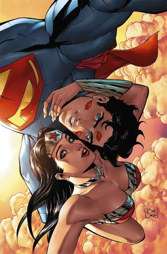
To his credit Tony Daniel is one artist that actually tries his damnedest to portray these two as a couple. In the other Supe books and Justice League, little mention is made of it. I appreciate he is actually drawing the book that features both their names on the title, but credit is still due. I also admire his determination to show them acting as romantic partners because they may kiss or hold hands, but outside of this book, the majority of their time is spent fighting villains. This is the reason why I like this cover and it is a lovely idea to show Diana and Clark actually being jovial and happy. It seems to be a rare occurrence these days but my issues with the Doomed storyline lie in other posts. Tony Daniel has a classical superhero style, very suited to the DC preference list because he has a firm grip of muscular anatomy and his protagonists always look suitably valiant. Even Diana looks incredible but her breasts are still far too big and buoyant, especially when they are in some form of armoured chest wear. The poses looks quite natural and I am impressed the flying dynamic seems to work so well. However the single most important feature that makes this cover standout is that both characters are naturally intimate. This is nothing to do with the ridiculous lipstick marks on Clark’s face but the way Diana hold his head, and how she leans into his face. Its a lovely image and an amusing adaption to the modern day obsession with photographing oneself. I won’t even dwell on the idea that they have a mobile on their person, because it is the idea that is the important part of the cover. I have often criticised DC for having dull covers which either feature a audacious superhuman pose, or a dramatic fight panel, so this is a welcome variation and provides some lovely insight into a relationship we see very little of. Its a shame it’s just a variant and not the main cover of the book.
