

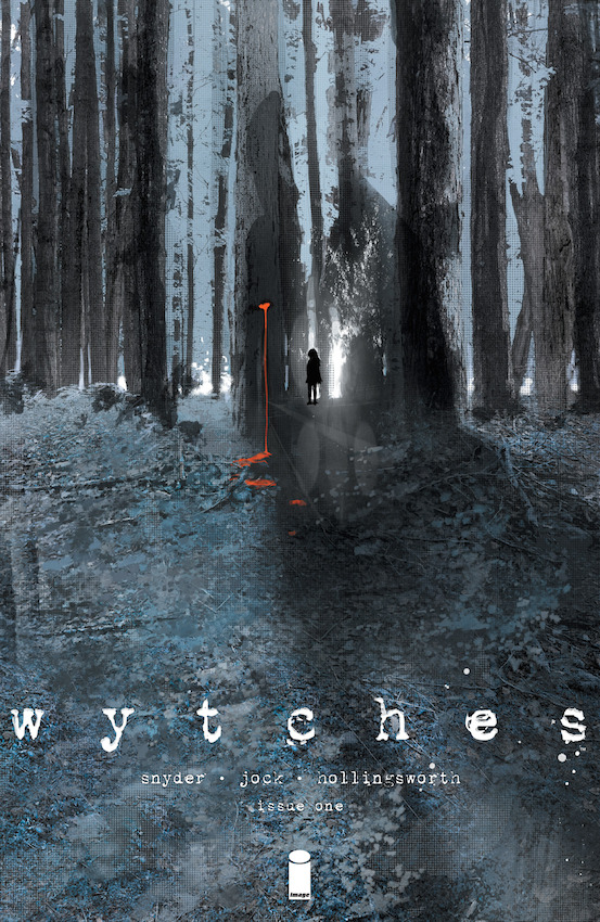
It is what you don’t see that chills you to the bone. The key to inducing fear has always been the anticipation of the unknown, which allows you to bend your notions of reality to become scared. That is the effect of this front page as the focus is central but appears to be a long reach away into the distance. This means we are in the dark heading towards the light and wondering what it is we can see there. A stream of blood dripping to the ground from a cut in the tree, a child’s silhouette which always intimidates and a strange arrangement of lights and reflections. I am unsure what lies ahead but you may just want to stay where you are. There is also a shadow that lurks from the right which seems to imply there is something behind, so in essence there is a rock and a hard place with a whole lotta fear in between. The sheer panic that this induces is terrifying as you have no idea where to look, let alone run. If we examine the cover in more detail, you will notice layers upon layers of images at different levels of transparency. This allows the texture to develop with a depth to the colouring, and the additional lighting brings a longer sense of perspective. I personally quite like the darker shades of blue of the leaves in the ground, it has more of an autumnal feel to it. The name of the book is also an indicator of a netherworldy phenomenon but the typeface is also quite unusual. The irregular edges and the splattered ink is so imperfect that it appears broken and disrupted. This also builds into the imagery of an unknowing force that serves to make you scared and potentially induce harm. All credit to Jock and Hollingsworth for producing such a wonderfully mysterious but beautiful front page.
