

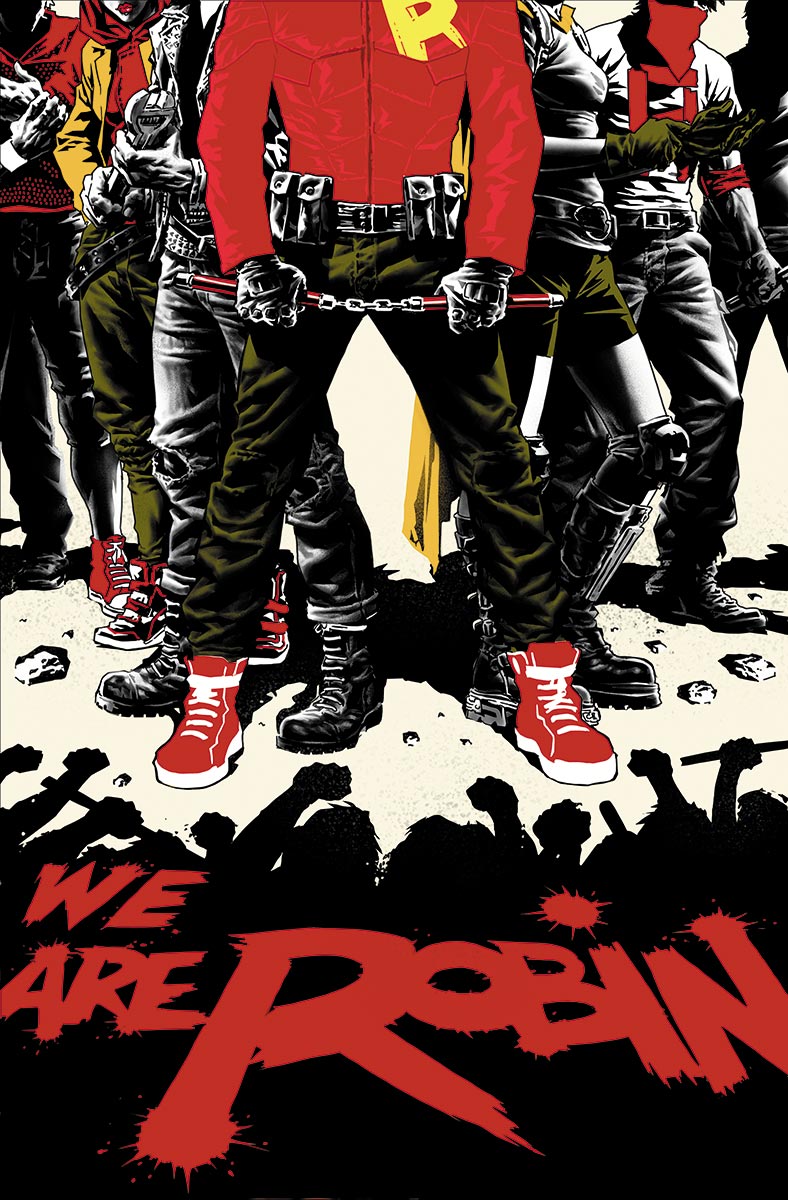
 I am quite surprised I have never discussed Lee Bermejo’s artwork before because he is an artist that is recognisable from afar. He has incredibly textured pencils and seems to colour his work black and white before any other tone hits the page. It provides a great sensation of depth and bears tension well when he draws big bulky characters. He is the type or artist you want on the epic musclebound heroes. We Are Robin is a strange book, in that I am unaware of the connection to Robin and it seems to me to be a book about young vigilantes. I appreciate there are some Robin ties to the characters but not specifically mentioned as of yet. The cover presents a menacing image of young hoodlums, but it is the Robin insignias that bring a sense of safety. Bermejo deliberately uses reds, yellows and even the classic green to bring a welcoming feel, but it is very intelligent in the way it is done. The scattering of colour is just enough to convey the message but not too much to flood the whole image.The silhouette effect is very clever because it presents a threat of a maddened crowd ready to punch. The utilisation of the title of the book together splattered in red with the Robins standing up is an immediate defensive response. They are the wall between chaos and order and with the colours of the Bat’s ward, there will not be outright war. Because We are Robin.
