

It is very fortunate that I reviewed Dead Body Road and now have moved onto Black Science because they both feature Matteo Scalera as the artist. Black Science displays the most incredible painted work and colouring credited to Dean White. Specifically it states Dean White performed the painted art which is somewhat vague, to the point where I decided to tweet Mr White to chance some specific information. He replied that all the colour in the book could be attributed to him, including the glorious watercolour backgrounds. I shall discuss this conversation at the end of the post but first we need to have a look a Black Science. It would be a disservice to Matteo Scalera not to discuss how impressive his art is and how gloriously complemented it is by the colouring. The reason for my fortune is that I have already analysed Scalera’s techniques and am in a position to examine Dean White’s contribution to the book’s art.

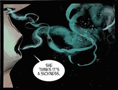 It must first be mentioned that the book has a science fiction adventure theme with multiple worlds and scenarios. These contain very imaginative creatures and interactions including underwater amphibians, world war trenches, and future technology American Indians. The book needs to look like it belongs in another time and place, and then continually switch to alternate dimensions maintaining its freshness and uniqueness. It is a compelling idea but succeeds because the art is rendered in the manner described above. It is difficult to know where to begin with Dean Martin because his range of skills are broad and varied. A sensible place would be what he is credited for: Painted art. The first page of each issue is often a large watercolour piece and looks gorgeous. The picture above shows a night scene with a forest silhouetted by a spark of bright purple light. It emanates form a central source and lightens the night bringing outlines of clouds and cracks in the sky. It is an impressive piece as the shades of purple are delicately arranged, but the lightning jolts are sporadic. The way in which the light spreads out from the middle is wonderfully portrayed. It is these same skills that are applied in producing the smoke as our character exhaling from mouth and nose. The pattern is smooth and curved to begin but then dissipates outwards. The green on black depiction is a very aesthetic representation of smoke in dim lighting. The specs of colour give an added layer of texture similar to the picture above. Dean builds on these backdrops as you will notice them appear in panels containing our central characters.

There are a number of scenes that are taken from afar giving a fish eye view of the world inhabited by its people. The futuristic war scene depicted above is one such example and in a single shot we know where we have landed. There is a woeful mismatch of technology as traditional soldiers are fighting what appear to be archetypal UFOs. I adore the contrast created by the colours as the military servicemen are drab and dull compared to their bright and colourful adversaries. Not only is their weaponry far more advanced but we witness their devastating effects with explosions galore. Once again White’s blast and smoke skills are put to fantastic use as we see the greys, yellows and oranges in effect. It would be interesting to see the creation of this panel because Scalera’s pencils are clear but the backdrop seems to be predominantly White. The next panel is similar but nowhere near as hostile. Here we see our scientific crew at their base, in what appears to be a tropical forest. The colour palette is blues, deep greens and purples and produce a completely different feel to the warring nations. The watercolour backgrounds are gorgeously blended and the subtlety of shade and light take your gaze centrally. The technology of the comic takes a complex aesthetic and extremely colourful. This is very apparent with this page because the device centrally exhibits a bright central orb, and the crew have an orange, white and red colour scheme. Their suits look spectacular and I am amazed at how it all fits together without seeming garish or loud at all. Once again I would love to see the artistic process and balance between White and Scalera.
 These combinations are once again shown in the contrasting panels below, where you notice a beautiful watercolour backdrop with Scalera’s pencils transposed onto it. There is a percipient grading of inking and colour that provides a transition from background to foreground. The icy table top mountain has such a quaint combination of planet, sky and cloud, but then focuses on the people atop it. The next panel then displays the intense scene with the crew in spacesuits and the antagonist in simple shirt and tie. The story moves on seemingly with a great appreciation for the world around them and once again does not appear odd or out of place. With the explosion scene it allows a blurring of red, orange, white and yellow but as we enter the foreground the stones and central character are delineated by borders but clearly interacting by shade and contrast to the surrounds. The explosion lines are key to this effect but it is the wonderful rendering of colour, lighter to darker shades that play into the big bang effect. These are once again fantastic examples of artist and colourist in perfect combination.


 If we pay closer attention to the facial shots we can see another important aspect of White’s work. The panel to the right is especially poignant because as much as Scalera has drawn the scarred face, it is the colouring that brings out the brow beaten appearance. The use of pinks and greys allow us to ascertain that this man is tired and weathered, especially the light effects in the side of his face. The skin creases are drawn but the depth is achieved by the colour gradients. This combination is also pertinent if you look at his uniform’s pencil shading and colour palette. Above all else the panel has to give the impression that this man is Grant but isn’t actually Grant, and that could not be done more perfectly. As we move on to discuss our final scenes we are left to appreciated possibly the most important feature of Black Science art: movement and intensity.
 The dive panel is so sublime because we see him moving from a cave to open space to the air. The sea is a lovely blend of blue green watercolours and the light from the torch is delicately shining along the underwater corridor. As he emerges the two features that convey emergence are the straight lines and splashes. The droplets are an essential effect in showing movement out of a body of water but the emphasis lines gives direction and speed. These lines are used by Scalera in his car chase scenes and are adapted here to show the blue green colours fade on Grant’s suit. As we look at the car chase sequence we can see a similar effect and the lines appearing along the jeep are coloured with the background shades but darker when in the foreground. The actual movement and is conveyed by a blurring of these colours, a movement from one space to another where the colour palette differs. This is effect is not used in Dead Body Road but actually keeps the image lighter and less obscured by darker lines. It is a lovely combination of pencil and ink. Once again the background shows an amazing blend of colours that significantly contrast the riders and their strange headgear.

Black Science is a spectacular book because it looks so impressive and allows such diversity in its art. The central characters’ appearance remains constant but the surrounds alter markedly. There is a freedom of expression for both artist and colourist which seemingly knits together beautifully. The pencilling must be carried out initially and then Dean White then builds a background and merges the art into it with great success. Dean White’s painted art places this comic head and tails above most comics and complements Scalera’s dynamic style. It is far more than what most people expect from a colourist and has been a pleasure to look into. When I received White’s reply he discussed why he was given the title painted artist. This is because he has moved onto painting backgrounds using watercolours and not a computer, when this happens the company drop the term colourist. The following paragraph is exactly Mr White’s response:
“I colored the whole book. The Painted Art credit seems to throw some people off. When I color a book with watercolors or acrylics they call it painted but when you do the same amount of work on the computer it is deemed less. When people say color they think just flat color or color with a grad and lite rendering, but I tend to get hired to color and add my sense of rendering to the page. To work over the line art a lot of the time. This does not make it better than doing it the other way but it is just different and a lot more time consuming. On Uncanny X-force I was asked to draw on top of a bunch of different artist, to add my sense of line on top of their art. It was seen as a way to keep the book visual cohesive even tho we were having a lot of great artist with vastly difference styles come on board. It was at least double if not triple the amount of work than what I was doing before but it was never acknowledged by anyone. To be fair I did not yell about it because I was having fun and wanted to do the best book we could. It was a bit of a sting when the Omnibus came out of the series and my name was not on the cover after all the work I had done. But once again I did not yell for it or demand it and if I had and made my case for it they probably would have. Some books I have done have been color jobs and I have had a great time with, but I think there needs to be some distinctions if you are spending hours if not days painting something. If a peniciller moves to doing all the black and white art they are no longer called a peniciller but the Artist. I feel it should be the same for people who take the black and white to finish for print, when you are being called to paint it. I think the colorist field is changing and expanding we can go from more graphic styles of color to more rendered as the book calls for. Not all the same cookie cutter style. The work should reflect you and your reaction to it. I have tried for the last 10 yrs to get someone to let me do a graphic style of color because in some instances it better serves the art and is so beautiful to look at. Love that stuff. Just a final note to say. None of this is possible with out the great art that we get from pencillers and inkers and they are always brought into the loop on the color art. They Have to be. It should be the whole creative team working together doing what the can to make the best book they can. When it does work it just shines and when it does work it shows. I always see this reflected in my work good or bad. The one other factor to all of this is of course your deadline, because no matter how much you want to do a good book if there is no time and it just needs to go out then that is what it is.”
It is quite clear that White has an essential role in Black Science and neither Matteo or Dean could exist without each other. As I write only my second ever colouring post, I have managed to stumble upon a man breaking the boundaries of colouring. His work is as important as the artist and his role in expressing themes and emotions is tantamount to the book. The world of colouring seems to have become quite the complex field in comics and I am thoroughly enjoying unveiling those secrets to the loyal comic reader.
