

Issue five of Velvet was a truly spectacular exhibition of the work Steve Epting and Elizabeth Breitweiser have been producing on this title. Epting has been a well-recognised artist for a long period of time and has been a personal favourite since his run on Captain America. His pencilling is often quite intense with a very particular shading style, befitting of serious and emotive plots. Putting him back in combination with Ed Brubaker was a notion I was very excited about. Over the first few issues it wasn’t just the writing or pencilling that gripping my attention, but the colouring that was bringing the book to life. I was firstly struck at how impressive the dimly lit cloak and dagger scenes were, especially given the theme of the book. They are not heavy shaded at the cost of detail but Bettie brings out unexpected colours without losing the tenseness of the scene. This inspired me to focus on the great Elizabeth Breitweiser as my third iconic colour post.
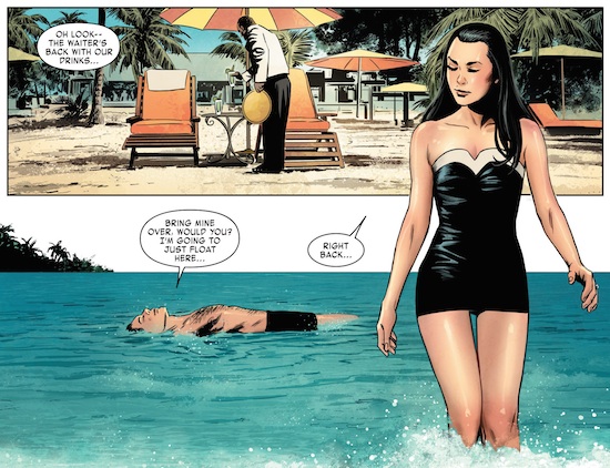
This particular issue contains various scenes and backgrounds and is very impressive at demonstrating the skills of our artist and colourist. As I highlight the panels that are most striking it is worth mentioning that Velvet is a book about undercover spies wrestling with intense paranoia between governmental agencies. You can imagine that the book nestles quite comfortable in the dark, which is why the opening scenes of this issue were quite surprising. It is not just the bright blue greens and the foamy white spots that make you wish you were there, but the delicate skin colour palettes. You can appreciate Epting’s detailing on Velvet’s hair and swimsuit, but it is the skin tones that impress her radiant skin and moistened appearance. The colouring is very delicate and faded allowing for the natural tones to merge but also for the shiny reflection of light around the contours of her physique. Steve does not have to add any further refining lines because Betty has provided that through the colouring. The panel is very much set in the bright sun of the Bahamas and is effective in depicting the lazy relaxation of a summer break.
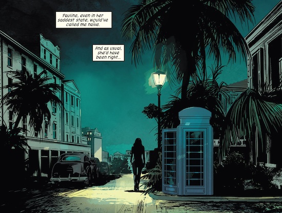
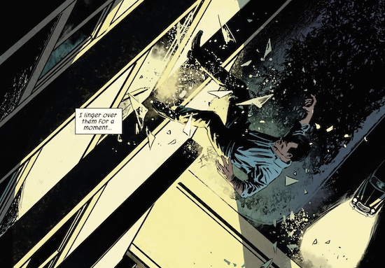
As we read further the book is plunged into darker scenarios and the exceptional skills of Breitweiser are borne out. Her landscapes are incredibly poignant and atmospheric with her use of subtle reflections of light. This panel shows a streetlight exaggerating the night sky around it, with a darkened aquamarine shade throughout. The buildings and roads provide suitable surfaces to mirror the light as Betty maintains perspective by fading the yellow white shades into the aquamarines. This is demonstrated by the shading of the building to the left of the picture. You will also notice the subtle silhouette detailing of the palm trees and cars, courtesy of Steve Epting. This effect is shown to a more emphatic degree in the scene below. The gentleman flying out the window is partly lit by the bright light of the room he has been ejected from. This creates almost a yellow grayscale appearance below his waist, and a darker shadier torso falling in the darkness. The success of the panel lies with two separate contrasting colouring sets. Even the gentleman’s face is lit with a clear peach colouration at the appropriate points. You have to admire the yellow, black and white colours merging in the darkness to light the upper half of his body.
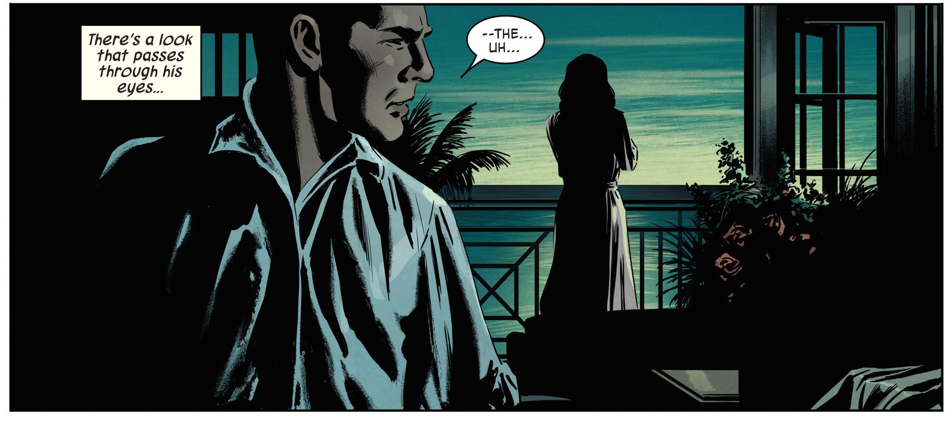
 This scene set inside a hotel room is another example of how to provide subtle of touches to bring a dark scene to life. Velvet has a beautifully slender silhouette with a simply shaded robe whilst Richard has a coarsely creased shirt, and Epting’s inking really bears that out. It is the delicate appearance of red from the roses, and the reflections from the table, which demonstrate the penetrance of the moonlight. These glimpses of colour contrast wonderfully with the silhouette of the objects in the room. Our soon to be male antagonist has a rather tormented face hidden away from Velvet, giving a worrisome image. The whole scene is unquestionably set in the dark but the shading nuances give an honest picture of the happenings of the comic. It is tense and ambient at the same time with a stirring glance overlooking a lover perusing the breath-taking sky at night. You can appreciate the location and emotional tension in the air as Breitweiser allows the surroundings to shine in the dark as the two characters come to confrontation.
 One of the final panels of this book is particularly poignant and is the best example of how to convey emotion in the dark. Once again Epting is superb in drawing shading and silhouettes, especially the curtains and Velvet’s robe. However it is the colouring that relates to the images gone by as we still have a lovely pink robe and subtle red shades of roses, but now there is more of a hazardous element displayed. The broken glass provides a various degrees of reflection and an irregular array of shapes. The red splashes of blood become faded splatters on her gown and her injury discolours it further. It is a frightful image as Velvet lies there with her hands in her head and her damaged past shattered around her. The tragedy of the scene is emphasised by the colours because it is difficult to display blood and glass otherwise, especially if you are trying to keep the scene in minimal light. The panel brings out emotions of devastation and sadness whilst reminding us of a better time not so long ago.
 Bettie is quite exceptional on this title because her work is of the right tone and texture to match a sixties espionage theme. The combination of judicious colour use and shaded inking is well balanced and appropriately utilised, especially at night. Otherwise there is plenty of room for Bettie to express her craft and bring out the atmosphere of the panel. This comic is an excellent example of how colour can be used successfully in different scenarios and how light can be used to illuminate a scene with emotion and candour. There are some wonderful effects especially involving specific objects and pertinent reflections. Most importantly for a book that is deeply set in betrayal and subterfuge, the art could so easily be heavy and sullen but Bettie Breitweiser prevents it from being so. Each page is alive with emotion whether it be the relaxing mood of a holiday in the sun, the angst of a young girl in training or the gentle sobs of a lover lost. Steve Epting is an excellent and experienced artist and it is very interesting to see how his art has a different feel because of Bettie’s colouring. This remarkable combination has provided a fantastic comic that lifts straight from the pages of a John Le Carré novel.

2 comments