
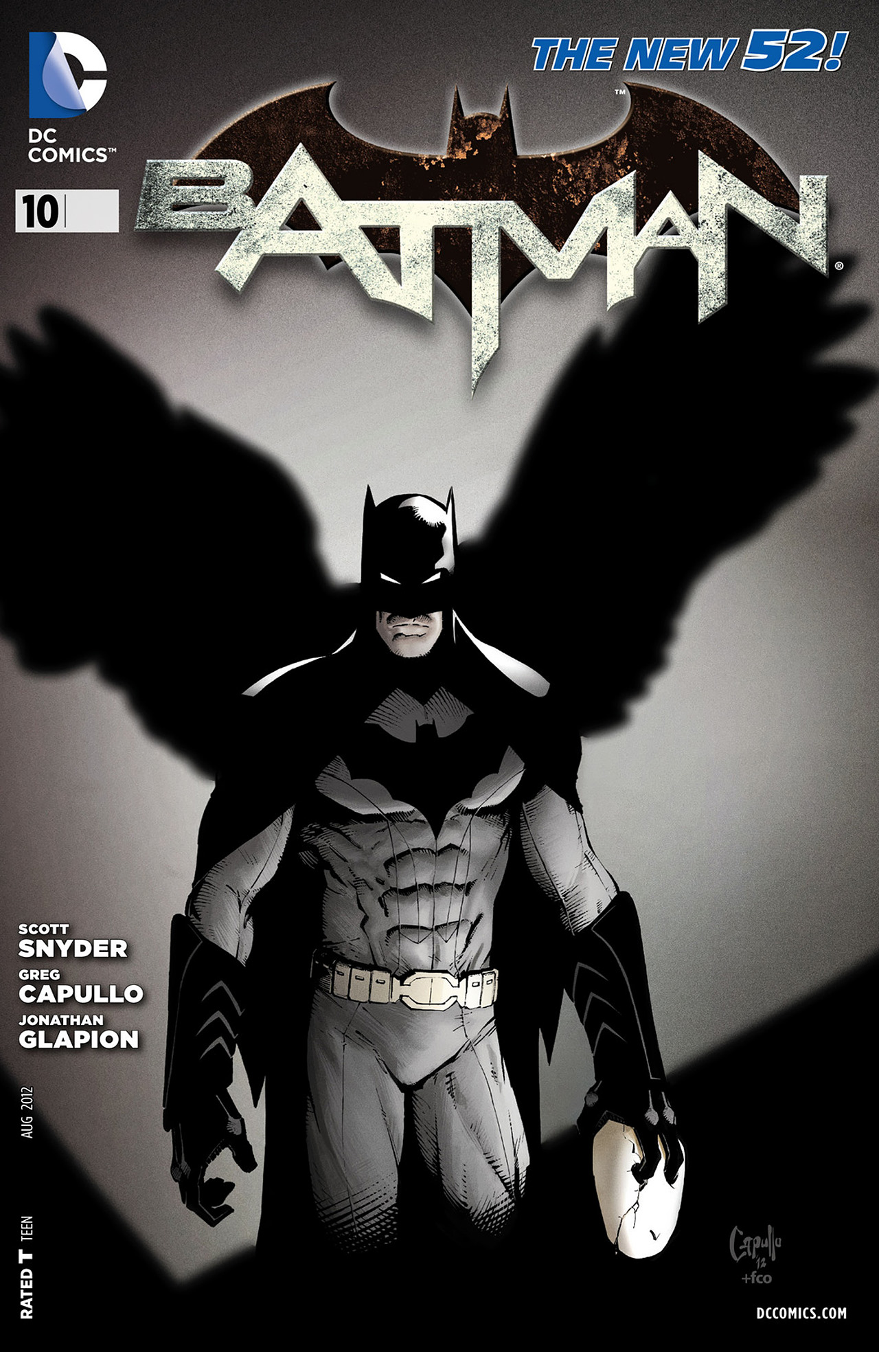
As I turned the page in the latest issue of Batman, I was left breathless as I saw Batman poised with glory and heroism, and spent a few minutes in complete admiration. This effect has occurred many times over the past couple of years, as I remain in awe of Greg Capullo’s artwork and how much I adore the way he draws the caped crusader. I jested that if he released an artwork compilation of all these images, I would buy every copy. That thought inspired me to write this post and look back at the images that we have all grown so fond of in the Batman comic. As I perused my back issues I noticed some differences in style and how Capullo has changed his protagonist ever so slightly with the changes in setting of the story arcs. The latest renegade of the day version of Bruce is still as impressive as the fly by night owl hunter, but it has allowed us to engage a new age, the zero year, ushered in by messieurs Snyder and Capullo.
 The recent flooding of Batman titles is indicative of the failings of DC, because you would think no other heroes are worth reading. The alterations in creative staff may not have set the world alight like the new 52 initiation did, but Batman has become, once again, the go to guy. With the development of a weekly title that is lead by Scott Snyder, we have currently at least ten Batman books to buy a month. They are set in different places, continuities and even worlds, making it is hard to make sense of it all. But as long as I have this comic and Greg Capullo on artwork I will remain a happy man. The image above was the panel that sparked my intentions for this post and I could stare at it all day. Not only is it refreshing to see Bruce in the daylight but it is fantastic to see him deconstructed to a base hero, who doesn’t even possess a complete Bat uniform. The hallmarks of the crusader are all there, despite the loss of perfection that we are so used to seeing: the pointed eared mask, the iconic symbol, the act of bravery and the leap for justice. Capullo has an ability to capture Batman at his most poignant, and he relishes in making him look like a saviour. This has always been the case and if we head back to the earlier issues, we see similar panels of Bruce at his most recognisable.


 These images look epic and glorious almost as if Batman was asked to pose heroically for them. The shading is darker and you can see the subtle detailing of the cowl that almost makes it come to life. There are some beautiful uses of scenery and lighting, bringing out aspects of motion, concentration and most of all, confidence. There was a tendency to overdo the costume refinements in the new 52 reboot, which can be seen in the earlier Batman outfits. You can also notice the added lines he uses to give texture and definition to his muscular physique. With the change of colour brought about by the reset to zero year there was a change to the artwork. The next images demonstrate this as you will see a brighter and more simplistic hero, without any loss in perception.

The zero year double page spread was truly phenomenal because we lost the close up focus we often saw earlier, replaced by an iconic image of Batman firmly in charge of his city and the Red Hood gang. Not only does the flaring of his cape look impressive but his posture is once again iconic as he captured mid action. You must make mention of Fco’s colouring because the landscape looks stunning and he provides the shading to the physique of the Bat. The hero is refined without a loss in definition. The image below provides further evidence of the fantastic combination of colourist and artist in making Batman look amazing in the light. It is not only his features but the motorbike and the unkempt surrounds the scene is set. There is certainly an important role here for Miki’s inking who seems to adjudicate the definition balance between colour and pen. In any case the transition of a dark Batman to a lighter one is made with excellent results.

As I researched the images for this article I came across some other moments that Capullo truly shines on, that of prolific action. Whether it be the centrepiece of an explosion or in the midst of a battle, Capullo keeps Batman looking impressive as everything crumbles around him. The explosion page looks damaging because you can really feel Bats being thrown, as he is flung, limbs awry towards us. The colouring, once again plays an essential role in directing the explosion and shading the cowl.

 The battle sequences are similarly well posed as Capullo plays the skilful action photographer. He also has a keen sense of perspective as the subtle changes in size and shapes of the characters add to the dynamic nature of the punches. A common feature of his work is how he utilises Batman’s mask. At times you only see a silhouette of the shape of Bruce’s head, with white patches for eyes. This succinctly portrays the mystery and darkness of Batman but at times we have additional details. The sharpness of his eyes and the gritting of teeth express the aggression and determination of the assault.
 The following image utilises the effects Capullo employs regularly but in a completely different tone. This is a more emotional scene as Batman almost whelps in despair to see his friend in agonising pain. The cowl remains the same and his posture is still upright but he supports Gordon as he grips his arm in desperation. It is a moment of terrible tragedy and is beautifully rendered as another splash page, one that is upsetting to look at.
 The final set of images depict Batman out of costume, as Bruce Wayne. The Capullo Bruce Wayne is recognisable everywhere as his Batman. The eyes and the jowl are instantly recognisable and is quite the aesthetic appearance. It fits for a younger Bruce as he has an air of youth and naïveté, and works wonderfully for Zero Year where we rarely see him in costume. His resolve and intent are wonderfully portrayed in his expression, mainly because of the arching of his eyebrows and sleekness of his eyes. Once again there is so much credit to give for Plascencia who fans the fires and shades his face so impressively. The latter image demonstrates how Capullo can actually show Bruce being effectively beaten, and utilise the same strategies of perspective and shading to deliver the impact of the punch.
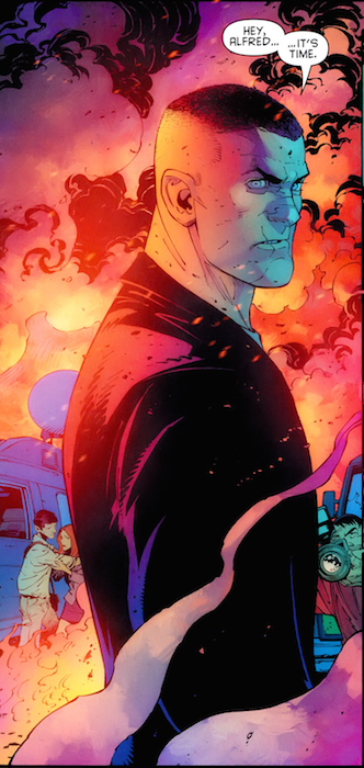

Before I finish with a final iconic image of Bruce’s transformation, you must allow me more time to wax lyrical about Greg Capullo, Miki, Glapion and Plascencia. As much as the post revolves around Capullo, there is so much credit due to the inkers and colourist because the reason why Batman shines so immensely on the splash pages is because of this specific combination. They deliver a synchronous single goal with great conviction, making Batman the hero we all want him to be, and as you turn that page, you will not want to turn another. I will leave you will a panel that typifies the evolution of the Bat, portrayed by one of the best artistic team in comics today.


1 comment