

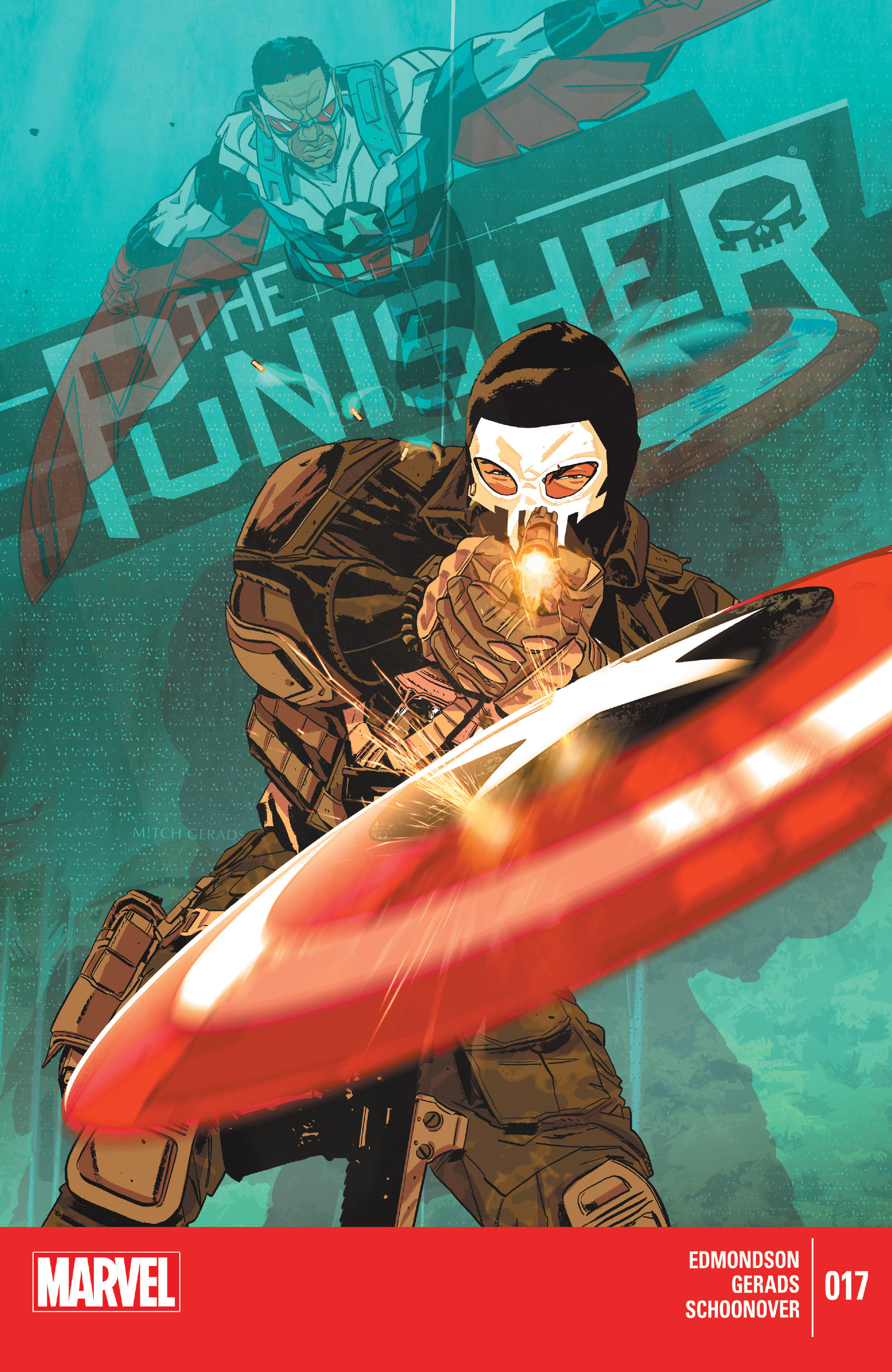
 Mitch Gerads has really come into his own with this book and his covers have been distinct and quite clever at times. As I mentioned last week, the use of Captain America has been justified in the way he was introduced and the cover is a representation of the occurrences in the book. This page tells a story and it does so in great style and gusto, not only do we seen Frank clearly fighting Sam from the massive shield flying towards him but there is a reflection behind him. Castle looks great in full military garb, signature hood and well poised to pull the trigger and Wilson, in full flight, has a menacing glare directed towards the Punisher. The use of perspective is employed to enact a part of battle and as the shots are fired, they clearly ricochet off the shield. The colours are bright and the white yellows match the gunshot and the bounce to make it obvious. The glass pane in the background is well rendered because it shows the subtle highlights of landscape as well as a dimmed version of Sam and the shield, you almost do not notice them. The centre of the picture is Frank shooting at the shield, which has some lovely blurring to emphasis speed and distance, and the title of the book acts as a banner across the glass taking your view away from anything behind it. It is a great tactic to not congest the cover with too much information but to allow it all to sink in slowly. Grads has excelled in all elements of his work from issue one to seventeen and I only hope to see more in the future.
