
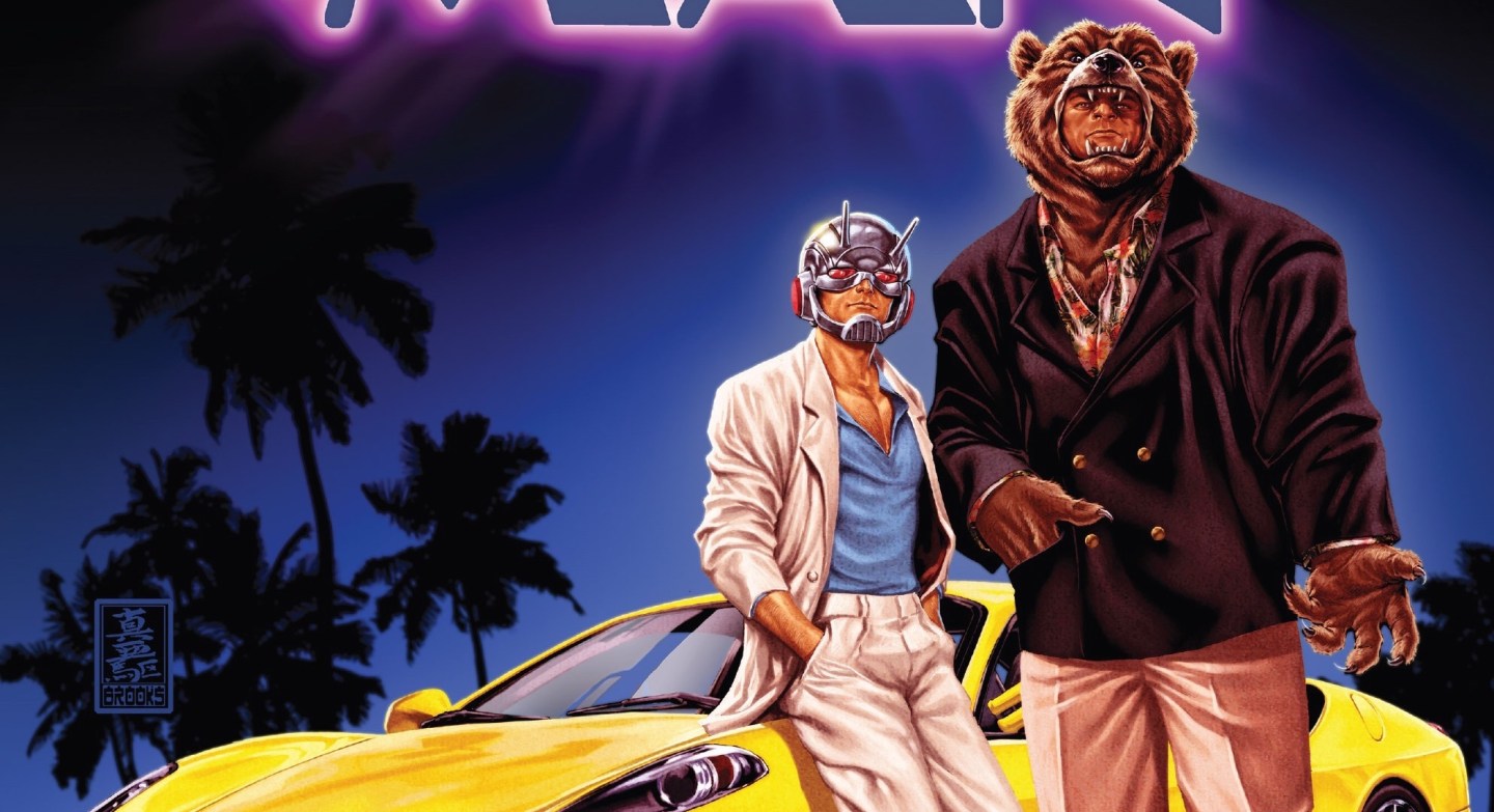
 Mark Brooks is an inventive and very dexterous gentleman as he takes the main feature of the book and spins it into a novel and relevant front page. I have discussed his inventiveness previously, especially with respect to those covers of Fearless Defenders. This one is no different as Miami Vice is certainly its cardinal feature. You have to admire the attempts at dressing up Ant-Man and Grizzly in cool suit jackets next to a dazzling automobile, classical of the 80’s Miami braggart. The lovely palm tree silhouette and bright night lights of the picturesque apartments all play into the theme, but it is the illuminated title font that really cement the intention. Of course it is not just the imagination that is to be admired, but also the skilfulness of his handiwork as there is such in depth texture and colouring. A fantastic example of this is the suit and the creases that are depicted, the way in which he shades brings great perspective. The colouring is an adjunct to this effect too but is also an immense aesthetic feature of almost all of his work. Incorporate all of these skills and you still have yet to define his most impressive skill; composition. The cover pages require a holistic approach and the way in which the page is laid is all important. An-Man features a central pose but the ground plays a lovely juxtaposition to the brightly lit skyline, even though the scenes are not related. It is no wonder we rarely see a Mark Brooks comic because he most devote such a long amount of time to producing these majestically innovative pages.
