
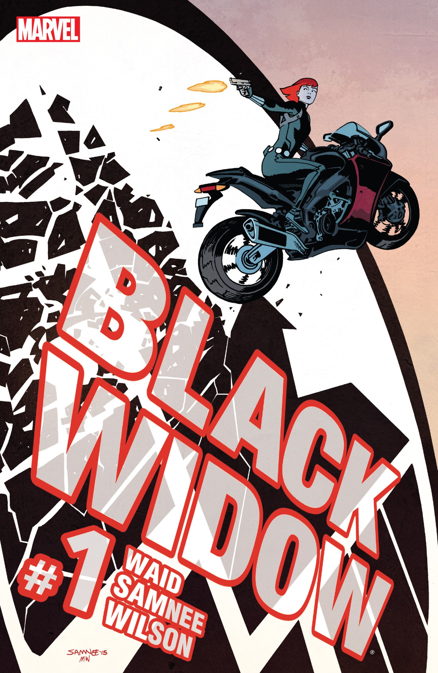

Statements like the one I am about to write are used far too often, but for these creators it is as true as can be: It doesn’t get any better than this. The iconography and the colour style is perfect for a front cover but what is really interesting is the prominence of the title and creator labels. I have rarely seen a page where the character themselves are the minority, almost as if to say the selling point is no longer the hero but the people who created the comic. However Natasha almost flying on her bike and shooting backwards towards a S.H.I.E.L.D. insignia provides an insight into the book itself. The sheer size of the symbol and title may reflect the target on her back and the imminent danger she is in. The shots fired and the glass shattered are great effects and symbolic of the fall of organisation. The colouring is wonderful as Wilson remains faithful to the red and black of Widow’s appearance and the shading of her motorbike and leather outfit is gloriously rendered It is Widow against the people who have kept her in their pocket for so many years. Given her chequered past and her debts to be paid, something big must have happened and this cover expertly emphasises that message in small size but massive effect.
